A Super Newbie’s Guide to Using InDesign to lay out your indie-published novel
 I’ve just published my fourth full-length indie-authored novel, a romantic suspense titled Dark Chemistry, and for the first time I used Adobe InDesign instead of Word.
By way of context: I believe in using maps, and I believe the best maps are the ones passed along by people who have successfully navigated the territory I’m planning to explore myself. Dean Wesley Smith has been in this business for a long time and knows his way around self- as well as mainstream publishing, and what he recommends is that authors release their titles as booth e-books and print books. I’ve followed his advice with all of my full-length novels, but in the past, I typically pubbed the e-version first and then—because it’s more complicated and scary—brought out the print version later (often a month or more later).
With Dark Chemistry, I decided to be a bit more disciplined: I released both the e-version and the print version at the same time.
And I also decided, with this novel, to switch from doing my layout in Word to doing my layout in InDesign.
When I mentioned this to Derek (who has done all of my novels’ amazing covers) he told me that he has some free InDesign templates available for download on his website (click here to get your copies). I found them helpful (thank you again, Derek!) but people aren’t kidding when they say InDesign is a complicated software application. I found myself banging my head on my computer screen several times during my first few hours with the software.
But eventually, I worked things out, and once my book was out I thought, “why not pass along what I learned to help other newbies get up to speed a bit faster?”
Note: the screen grabs in this document are taken from InDesign version 9.2.1.
Where to get the software
If I understand correctly, the current version of Adobe InDesign is available as a cloud application only. You obtain a license to use it through the Adobe website here; it costs $19.99 per month. However, I used a 30-day trial to lay out Dark Chemistry, and in my experience, if you’ve never tried InDesign, formatting a novel is a great way to figure out if you want to commit to the software long-term.
And by the way, although the application itself is cloud-based, it does install some software on your local hard drive. You can work on files even if you don’t have Internet access (once everything is installed). And when you save, your work is saved to your local hard drive, so even when your trial is over, you have the work in your possession.
I drafted the novel in Word, and I used “styles”
Derek, in his webpage about using InDesign, recommends that you take advantage of Word’s “styles” functionality to do things like set your paragraph indents. The advantage: you can change things (say, make your indent narrower) by specifying a global changes one time, instead of having to go through the entire document and changing the indents one paragraph at a time. Google “how to use Styles in Word” if you need more help with this.
The InDesign menu items I used the most & where to find them
1. File >> Document Setup
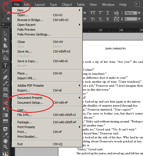
What I used it for:
- Set the number of pages.
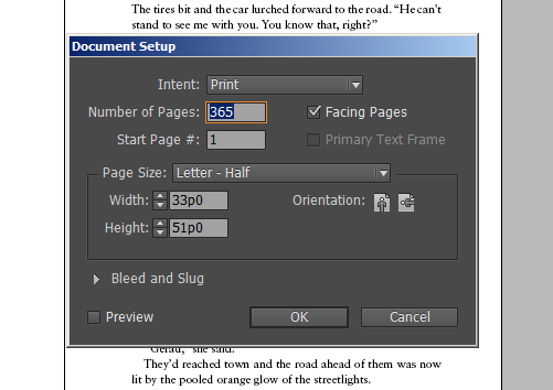
Unlike a word processor, InDesign doesn’t automatically “grow the space bigger” because you put more words in it. You have to tell it how big it has to be. But wait, there’s more! InDesign also doesn’t automatically “know” that text should flow from page 5 to page 6, or from 6 to 7.
You have to tell it how you want the text to flow by using “threading.”
To tell the text to thread, you need . . .
2. The Selection Tool
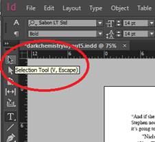
What I used it for:
- Threading text (as per the previous section on adding pages to the document).
- Lots of other things – it’s the basic tool you use for things like editing text.
For threading text, when you pick the selection tool and click on a page, a thin, light blue border will show up, like this:
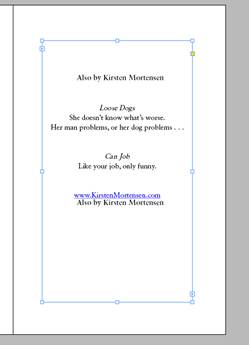
And down in the lower left hand corner is a little icon . . . a tiny arrowhead in a box.
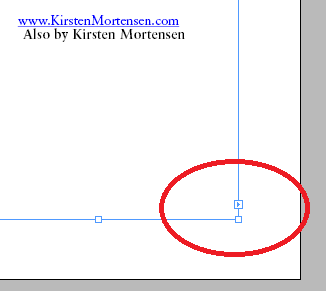
Click on that now, and InDesign knows that you want some text from the current page to flow onto another page. If this were page 70, for example, you could scroll to page 71, and click on it, and your text would flow to page 71.
OR: click on it, then hold down your shift key and click again: and InDesign will automatically create new pages and flow your text to them at the same time.
Here’s Adobe’s help page on threading if you want to learn more or my explanation isn’t clear enough. Remember, I’m a super newb J
3. Edit >> Find/Change
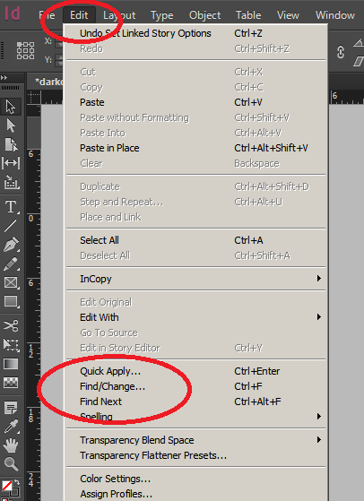
What I used it for:
- Tons of things. This is your basic Find/Replace tool that you use in Word and probably every other common software application
4. Type >> Character Styles and Type >> Paragraph Styles
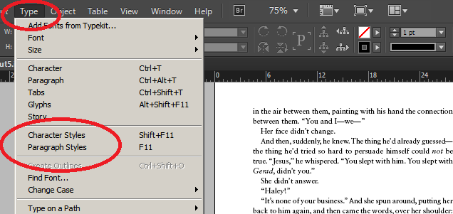
What I used them for:
- Remember that bit earlier about using Styles? Here’s one way you can navigate to the Styles as they are presented in InDesign. I used a particular font for my Title, for example. I can change it from here by selecting Character Style.
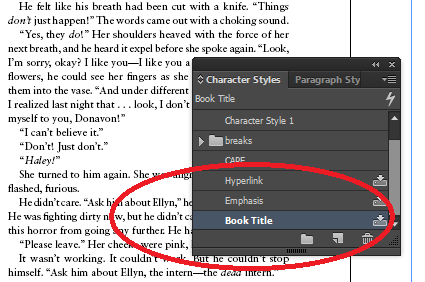
If you click on Paragraph Styles, you get a dropdown menu (that looks very similar to the one above) of the styles you’ve defined. Double click on one of your styles, and you get a menu that looks like this:
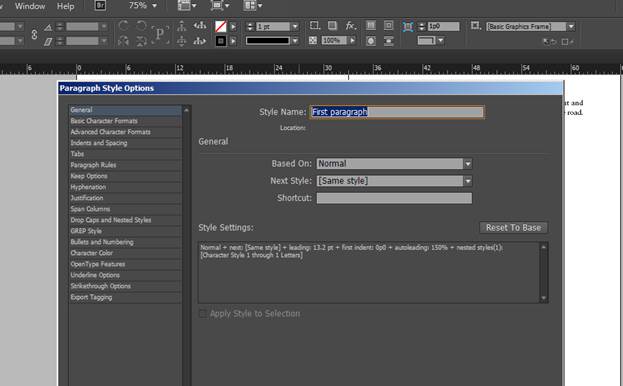
The options for changing your paragraph styles are on the left.
5. Type >> Insert Special Character >> Hyphens and Dashes >> Nonbreaking hyphen
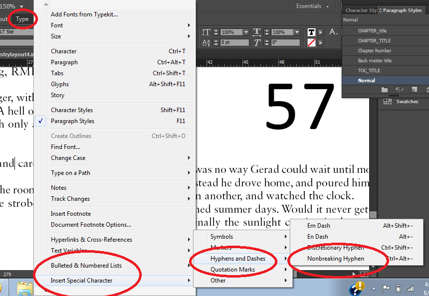
What I used it for:
- For places where I didn’t want hyphenated words to break to a new line or page.
6. Type – Insert White Space – Nonbreaking Space
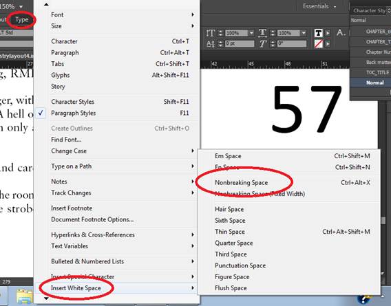
What I used it for:
- To create ellipses that wouldn’t break in the middle onto a new line or page.
In my e-version of Dark Chemistry, I used this format for ellipses: … (that is: a space, three periods, another space). For ebooks, this helps ensure that pages and lines won’t break in the middle of ellipses when the text is rendered by the e-reader.
For the print version, however, I wanted to use a more traditional ellipsis . . . which has spaces between the periods . . . but I didn’t want that to break in the middle, either, so I used the non-breaking space tool. First, I created the ellipsis by inserting non-breaking spaces between the periods on one of my ellipses. Then I selected that custom-defined ellipsis and copied it (CTRL-C). Finally, I used the Find/Change tool to do a global replace of all the ellipses in the document with my new non-breaking ellipsis.
7. Type >> Character Styles and Type >> Paragraph Styles >> Leading
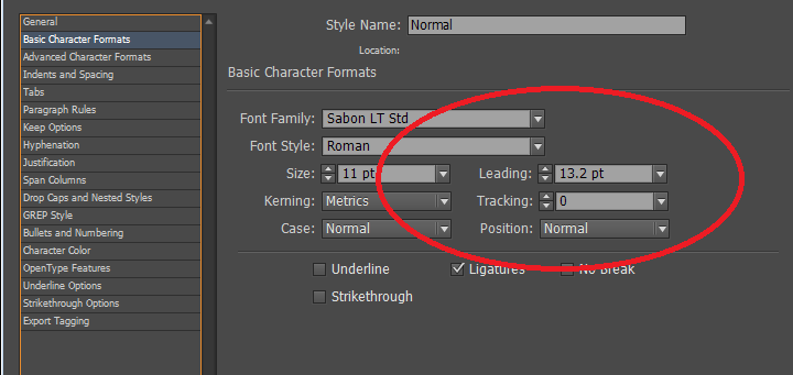
What I used it for:
- Adjusting leading.
If you’re not familiar with the term, “leading” (pronounced ledding) is the amount of vertical space between the lines.
In Dark Chemistry, I made the leading slightly larger than the 13.2 setting that was the default on the document. I felt a slightly greater leading “opened up” the page a big and made it more pleasing to the eye and readable.
8. Layout >> Margins and Columns
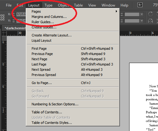
What I used it for:
Setting my margins. Derek gives advice on that on his webpage. Remember that for a print book, the inner margins need to be slightly wider than the outer margins.
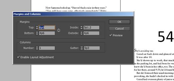
Note also that when you want to input your margins, if you use inches, you can type them in using inches. When InDesign displays them, they’ll be converted to points.
9. Window >> Pages
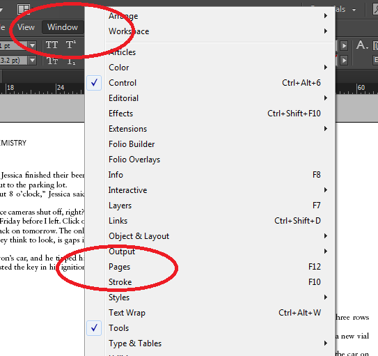
What I used it for:
- Applying my Master Pages settings to pages.
This is one way to bring up the Master Pages window; the window looks like this:
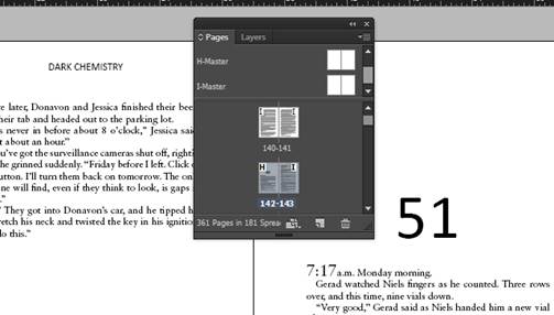
Master pages are an InDesign feature that let you assign certain layout characteristics to some pages and not others.
I didn’t set up my Master pages, because I downloaded a template Derek created. But I did use them to apply to pages in my novel. For example, I used the H-Master format for the first page of every chapter, because that master doesn’t have headers or page numbers. I used the I-Master format for the rest of the pages in the body of the novel, because that does have headers and page numbers.
10. The kerning icon
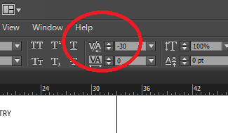
What I used it for:
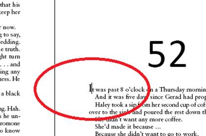
- I wanted to use a fancy initial cap for the first letter of every chapter, but I also wanted the rest of the letters to snuggle up next to it.
Yes, I realize I’m not using proper typesetting lingo. That’s because I’m neither a typesetter nor a designer.
In case you, like me, are not a typesetter or designer, I’ll try to show you what I mean. Notice that in the above screen grab, the setting is -30. Here’s what the screen looks like where I’m changing that setting:
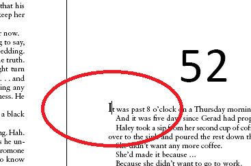
As you can see, my cursor is between the “I” and the “t.” I’ve set the kerning at -30, so there’s not a big space between those two letters.
In case that’s not clear, here’s an example, zoomed, to show how funny the text would look if I didn’t tighten the spacing. See how funny it looks to have that big gap between the “T” and the “h”? InDesign lets you fix that. Yay.
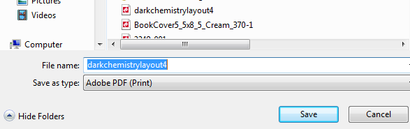
11. File >> Export
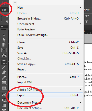
What I used it for:
- To create the PDF file that I uploaded to CreateSpace to print.
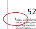
A note on Widows and Orphans
If you’re not a typesetter or designer, and these words are new to you, take a little time on Google bringing yourself up to speed.
Widows happen when a page break leaves a word or line all by itself on a page.
Orphans are a single word at the end of a paragraph, that’s left on its own line.
Before you finalize your manuscript, you need to go through it page by page, and if you find widows or orphans, adjust the page to fix them.
What I did was use the Type tool to make very slight adjustments to the text box on the page with the widow or orphan. Sometimes I make the text box slightly larger, so that the widow or orphan would fit. Sometimes I made it slightly smaller to force a companion line to join the widow or orphan.
One other thing: hunt for and fix Widows and Orphans from the beginning of the book to the end (because any changes you make to the beginning may cause changes later in the manuscript, which could create new Widows and Orphans, or if you’re lucky, get rid of them J)
And do Widows & Orphans last, for the same reason: any other formatting changes you make may create or fix them.
Have fun!
Adobe InDesign has a zillion features of use to professional designers. As a self-published novelist, I don’t need most of them—I probably only need 1-2 percent of what InDesign can do.
The functions I documented here represent almost all of the InDesign tools I used.
That said, that handful of features does make for a nice-looking layout. I will very likely use InDesign for my next novel—after all, I want my interiors to stand up to Derek’s covers J
Kirsten Mortensen’s latest novel, Dark Chemistry, is a romantic suspense. Click here to read a description and a sample.
Written by: selfpublish
Derek is a book cover designer finishing a PhD in Literature. These days he spends his time building tools and resources to help indie authors publish better on his blog, www.creativindie.com. Read MoreRecommended
-

5 Tips to a Great Book CoverAugust 15th, 2020
-
Publishing help for indie authorsFebruary 10th, 2015
-

Why you need to become a manager to self-publish successfullyAugust 29th, 2014
-

Don’t Go Out in Public Naked: How to Nail Your Book Cover by Avoiding These MistakesJuly 17th, 2014
-
A Super Newbie’s Guide to Using InDesign to lay out your indie-published novelJune 20th, 2014
